Shop, Dine, Mies 10 May 2012
A few weeks ago I had dinner in a strip mall. This is something I do occasionally. Regular readers may recall Two Days in Nevada, in which I recounted having dinner at a Thai restaurant in a strip mall in Las Vegas. This time I had dinner at a Thai restaurant in a strip mall in Detroit.
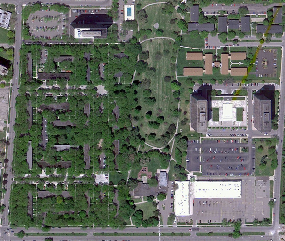
In Vegas, the restaurant was the attraction; in Detroit the strip mall was the attraction. Anchoring the corner of Lafayette and Orleans Streets on the east side of town, are two one-story retail blocks connected by a small plaza with a parking lot out front. A two-story office block used to occupy the south-east edge of the site; it was torn down a few years ago but its location is still visible in the satellite view.
The Shops at Lafayette Park were built in 1962-63 as part of a large urban renewal scheme that obliterated the old east side neighborhood of Black Bottom, the heart of Detroit’s African American community, replacing it with an interstate and mixed use development. Though a 78-acre site was cleared in the early 1950s, it was not until late in the decade that redevelopment plans were announced.
Eventually–and famously–a dream team from Chicago took over the site: Herb Greenwald as developer, Ludwig Mies van der Rohe as architect, Ludwig Hilberseimer as planner, and Alfred Caldwell as landscape architect. Their superblock scheme included a mix of high-rise apartment towers and low-rise townhouses, along with a variety of community amenities, including a public park, an elementary school, and a shopping center. While the site was not entirely developed according to this plan, the portions that were are now part of the 46-acre Mies van der Rohe Residential District (listed on the National Register in 1996).
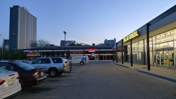
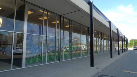
The district includes the shopping center; though not designed by Mies, it’s a fine commercial adaptation of his beinahe nichts minimalist approach. Harry King and Maxwell Lewis, the local team responsible for the Shops, employed a compositional modularity and a material palette that echo the nearby towers and houses–covered walkways front open plan retail space, all executed in black painted steel, buff brick, aluminum trim, plate glass. King and Lewis were so pleased with their work here that they moved into the 2nd floor of the office block as soon as it was finished.
Though the 45,000 square foot complex was threatened with demolition in the early oughts, a new owner (First Commercial Realty) renovated the site in 2004 with an eye towards the marketing value of the Shops’ modernist pedigree. (Of course, these are the same owners who tore down one of the center’s original blocks, but never mind.) In addition to refurbishing storefronts and replacing sagging canopies, First Commercial also renovated the pedestrian area connecting the remaining blocks.
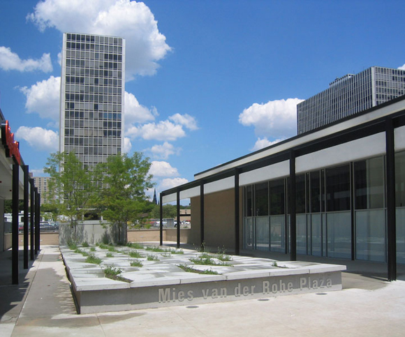
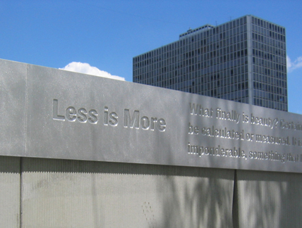
Designed by PLY Architecture and peg office of landscape and architecture, the Mies van der Rohe Plaza is a raised rectangular slab of concrete tiles. Along the edges, these broad tiles are ideal for sitting, but they also deflect asymmetrically from the surface to reveal narrow openings planted with trees and grasses. The slab terminates vertically in an uninspired memorial wall. Typical great man stuff, the aluminum coping is inscribed with Mies’ name, dates, and a few quotes. Predictably, “Less is more” is given pride of place.
I don’t really mind, but it gives the whole plaza an air of taking itself too seriously and, aside from leaving people with the impression that Mies designed the Shops, it threatens to undermine the Gruen-like playfulness of the seating/planting slab. I’m only fussing about the details because there are details to fuss about (“God is in the details,” even if that’s not inscribed on the wall): somebody actually spent the time and money to restore the Shops; somebody thought the residents of Lafayette Park deserved a retail environment as pleasing (and as meticulously maintained) as the rest of the neighborhood.
Of course, you can improve the retail space, but that’s not the same thing as improving the retail–especially in Detroit. Indeed, despite the renovation, there is still plenty of vacant space and, thus far, the Shops have been unable to attract the national chains that are typical of this sort of commercial development, and usually necessary to their economic viability. When I stopped by in April, the owners had let a local design group take over prime, un-leased space for an exhibition and other public programs.
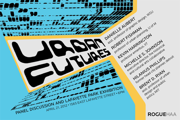
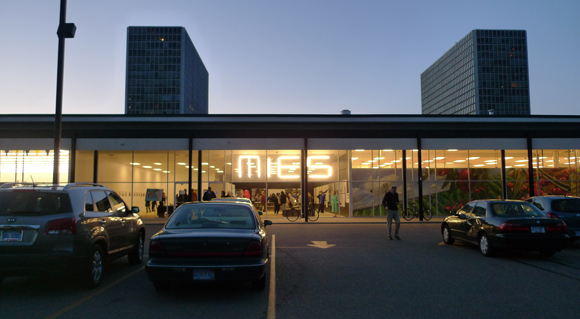
RogueHAA is an architecture/urban design collaborative dedicated to generating productive discourse about Detroit’s “urban futures.” At the Shops they installed an exhibition about Lafayette Park’s past and future that gave equal consideration to the Black Bottom neighborhood it replaced and to the folks who live there now, many of whom turned up for a lively panel discussion the night I was there. To advertise events related to “Inside Lafayette Park” RogueHAA installed a large sign just inside the floor-to-ceiling plate glass storefront–a dozen+ florescent tubes spelling out M I E S.
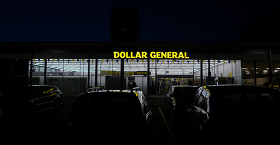
The sign’s combination of Flavinesque simplicity and pop wit was pitch perfect, in a learning from Bob and Denise sort of way. Not sure what Phyllis Lambert thought of it. I heard she came by during the day. The sign definitely looked better at night. In fact, the whole strip mall looks great at night, even the low-rent retail.
Turns out that good design, even when it’s Miesian rather than Mies, can do wonders for a place. In my travels across this vast country, I don’t believe I’ve ever encountered a better looking Dollar General.

Leave a Reply
You must be logged in to post a comment.