Shag 31 January 2011
Last week I found myself debating the merits of orange shag carpeting with the president of my university. I’m not quite sure how a conversation about burying power lines veered into one about 1970s interior design, but afterwards my thoughts kept returning to shag.
In 1970 we moved to Cincinnati into a big stone house from the early 1920s. My parents bought the place from a couple with an affinity for shags which they installed wall-to-wall all over the house, with increasing garishness on each floor.
…..
…..
…..
…..
…..
…..
…..
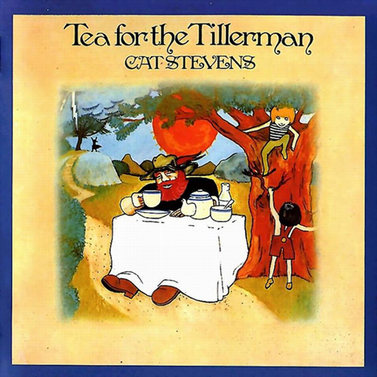
The shag in the first floor living room was only a shade darker than the harvest gold appliances in the kitchen and it provided a pleasing background for the LP cover art I admired while sitting in front of the hi-fi.
The shag in my sister’s 2nd floor bedroom was deep red. The acrylic threads were dense and irregular, just right for rolling a toy lunar rover and pretending it was the surface of the moon.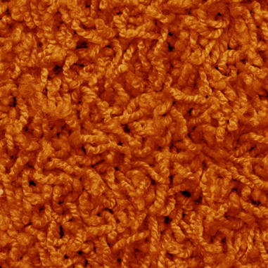

The shag in the wood paneled rec room on the third floor was bright orange. The color was a startling contrast to the dark green ping-pong table that filled the center of the room, but it was perfect for stretching out and watching TV, which I remember doing quite clearly on an August afternoon in 1974 when my mother called me upstairs to watch Nixon resign the presidency.
We moved out of that house a few weeks later (this had nothing to do with Tricky Dick), and my relationship with shag came to an abrupt end. Our next house had no wall-to-walls and certainly no shags, as my parents’ refined taste tended towards Orientals. But there was always a vague longing and in 2010 I finally got back together with shag.
…..
…..
…..
…..
…..
…..
…..
…..
…..
…..
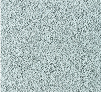
Sadly, though, my current shag is not orange; it’s a restrained light blue, a set of Flor tiles called “frost.” Only the style name, Rake Me Over, is a vague nod to the outré sensibilities of the swinger decade. Or it could be the title to a song by Elvis, something with an “All Shook Up” groove.
Elvis liked his shag. The Jungle Room in Graceland is a veritable monument to shag. 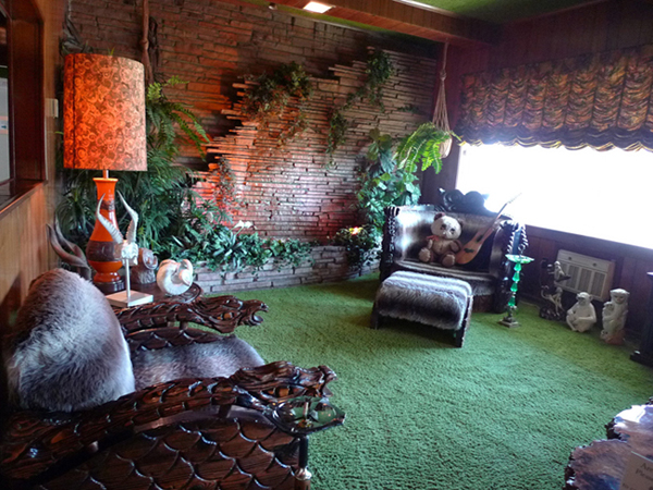
There are deep-pile green shags on the floor, on the walls, on the ceiling.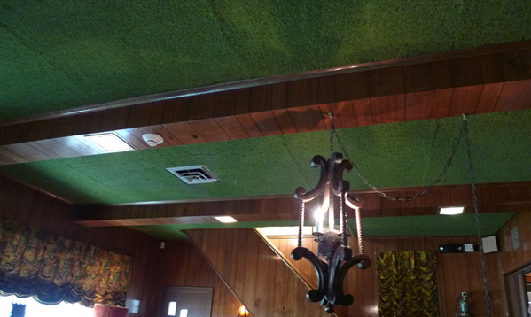
Originally, Graceland itself was little more than a slightly aggrandized center hall colonial, built in 1939 on the suburban outskirts of Memphis. Elvis expanded it gradually over two decades and the Jungle Room is part of the addition that commenced after he bought the place in 1957. Though Elvis was working with decorator Billy Eubanks by 1970, credit for the interior of the Jungle Room, which was completed by 1964, is generally ascribed to Elvis himself.
In the standard highbrow reading, Graceland is a temple of über kitsch and the Jungle Room is its holy of holies. But once you’ve actually been there, the plastic plants, artificial waterfall, ceramic monkeys, smoked mirrors, and all that shag are somehow touching. They seem more aspirational than gaudy—the fulfillment of the American Dream for a white trash kid from Mississippi.
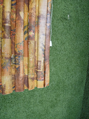
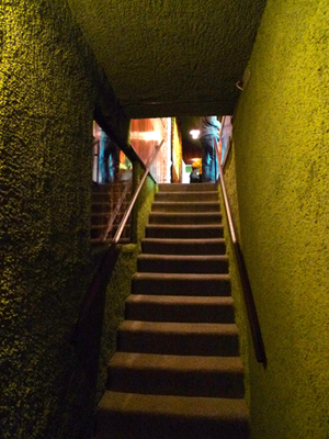 Nonetheless, the green carpeting on the walls and ceilings stays with you. Not because it’s kind of tacky but because it seems, somehow, to cross the same boundaries as Elvis’ early music and performances, upending the proprieties of mid-century, mid-American domesticity.
As it turns out, Elvis was not alone in his carpet transgressions. Neatly bookending the Jungle Room are Paul Rudolph’s A+A Building at Yale of 1963 and Philip Johnson’s Art Bunker at the Glass House of 1965. 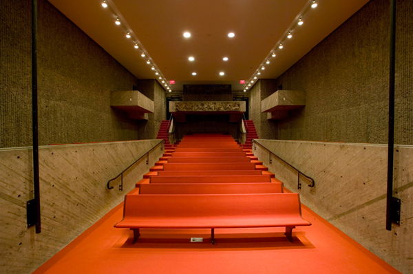
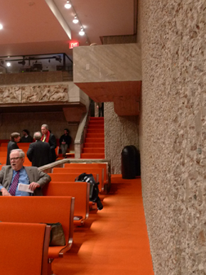
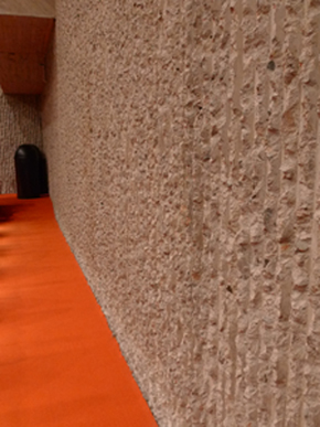
In the A+A lecture hall, the floor’s orange high-traffic carpeting runs seamlessly a few inches up the walls. This isn’t that unusual; linoleum was often installed this way in the 1930s in a streamlined elimination of the baseboard. But Rudolph went further and used the same carpet on the seating as well. This intensifies the presence of the orange against the finely crafted exposed concrete, both the smoother surfaces flanking the center aisle and the bush-hammered corrugations of the outer walls.
…..
…..
…..
…..
…..
…..
…..
…..
…..
…..
…..
The overall effect mediates the room’s horizontality and verticality, creating a kind of spatial continuum, a mid-century condition that George Wagner usefully analyzed in his 2002 Perspecta essay, “Ultrasuede.”
In the Art Bunker, the carpet is everywhere EXCEPT the floor. 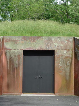
 …..
…..
…..
…..
…..
…..
…..
…..
…..
…..
…..
…..
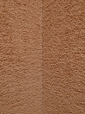
Passing into the vestibule from the Treasury of Atreus entrance you feel like you’ve stepped into a high-style cave, and one wonders if Johnson visited the Underground World Home Corporation’s model dwelling not far from his NY State Pavilion at the ’64 fair in Queens. Here in New Canaan, in combination with the low ceiling, the carpeted walls are utterly enveloping.
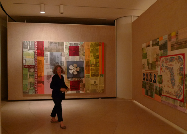
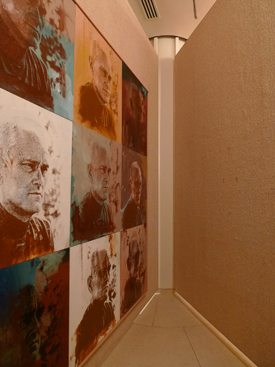
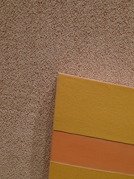
In the main space, the John-Soane-meets-Maltese-temple gallery, Johnson carpeted the rotating floor-to-ceiling panels that display his painting collection. The neutrality of the carpet’s buff color is undermined by its shaggy texture, but somehow this enhances the pictures.
…..
…..
…..
…..
…..
…..
…..
…..
…..
…..
I could draw some big conclusion about rebels and iconoclasts and 20th century taste, but I won’t. Thinking simultaneously about the carpet predilections of Rudolph, Johnson, and the King is more than enough.


Leave a Reply
You must be logged in to post a comment.